Interactive Versus Linear Demo Formats for Enterprise SaaS Onboarding
Interactive demos boost activation by matching the right format to each onboarding moment.
Enterprise onboarding is where most of a SaaS company's revenue gets decided, because users who reach first value quickly retain at far higher rates than those who don't. That stake is why format choice deserves real attention rather than habit. Most onboarding teams still pick one demo format, interactive or linear, and apply it everywhere, treating the decision as a one-time setup task instead of an ongoing judgment call. That habit costs activation because the two formats do different jobs, and a single default can only ever fit half the moments it gets used for.
Why enterprise onboarding teams default to one demo format
Picking one format and sticking with it feels efficient. Building a library that mixes recorded walkthroughs with clickable, action-required tours looks like double the production work for a team that's already stretched. So the default wins by convenience: a product tour gets slapped on every new signup, or a recorded walkthrough gets sent to every handoff, regardless of who's watching or what moment they're in.
The cost of that convenience is visible in activation numbers, because reaching first value fast is what keeps a user coming back, and the format that gets them there depends on the situation. A format that's wrong for the moment doesn't just underperform. It can actively work against the user, asking them to click through steps when they need context, or making them sit through a video when they're ready to act. The fix is building the judgment to assign the right format, moment by moment, across the onboarding sequence.
What separates interactive and linear formats
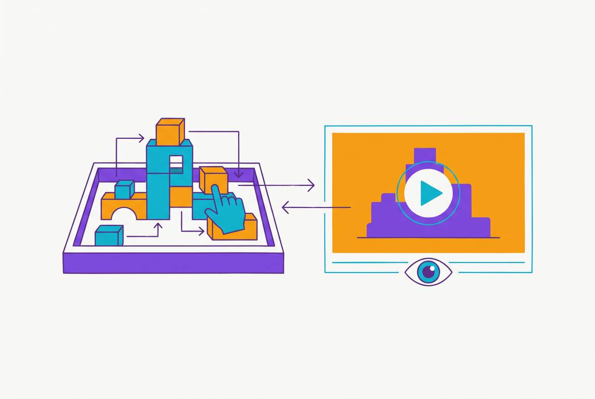
The two formats aren't just different styles of the same thing. They ask different things of the user, and that difference changes what the user walks away remembering. Linear video transfers information passively: the user watches, the sequence plays out the same way regardless of what the viewer does, and the message arrives the same way every time it's shown. Interactive walkthroughs require the user to act: a step only advances once the user clicks, creates, selects, or imports what the step is asking for, and that requirement changes how the information gets encoded and whether it sticks.
Linear formats run on a transmission model. A recorded walkthrough, a demo video, an annotated screen recording, all deliver a fixed sequence no matter what the viewer is doing on their end. That makes them controllable and consistent: the message doesn't drift between reps or between viewings, and the asset can be paused, rewound, shared as a link, and consumed on the viewer's own schedule. Interactive formats run on a learning-by-doing model instead. The act of completing a step is what produces retention, more than the act of watching a step get described. That also means interactive formats generate behavioral data, showing which steps users complete, where they stall, and what they skip, data a linear video simply can't produce.
Figma's onboarding makes the contrast concrete. Instead of a slideshow describing features, it asks new users to create a file, draw a shape, and invite a collaborator. By the time the sequence ends, the user has a prototype they built themselves, and that onboarding drives a 65% activation rate. No linear video, however well produced, can hand a user something they made with their own hands.
That's also why the two formats split cleanly along what they can teach. Interactive walkthroughs are built for products with a clear, clickable interface, because the UI itself becomes the instruction. Linear video handles conceptual framing, context-setting, and products built around data visualization, where there's no obvious "click here" moment to require. So the real question a team should ask when planning a given onboarding moment is what cognitive job that specific moment requires: does the user need to understand something, or do something?
The three variables that should determine which format a given onboarding moment needs
Three variables settle that question for any given moment: the stage of onboarding the user is in, how complex the action being taught is, and the context the audience is in when they consume the content.
Onboarding stage comes first. Early in the funnel, before signup and during evaluation, a linear video or an ungated interactive tour on the pricing page works, because the user hasn't committed enough attention yet to work through a full multi-step walkthrough. Once a user is in their first session, in the activation window, an interactive walkthrough is where the learning-by-doing effect produces real retention and activation lift. Later, once a user is past activation and exploring new features on an ongoing basis, a hybrid approach fits best: short linear videos for framing new concepts, paired with in-app checklists and interactive nudges for specific feature adoption.
Complexity of the action comes second. Simple, repeatable UI actions, creating a record, inviting a teammate, setting a permission, are what interactive walkthroughs are built to teach, because the action is clear and the interface itself is the instruction. Conceptual or data-heavy material works the opposite way. How a BI dashboard aggregates data, what a compliance framework actually requires, why a workflow is structured a particular way, none of that has an obvious clickable step, so a linear video needs to explain the concept before the user ever touches the interface. If a product is mostly data visualization or highly technical by nature, a linear video will tend to convert better than an interactive format built around actions that don't exist.
Audience context comes third. A stakeholder who got forwarded a link in the middle of a buying cycle, with 90 seconds before their next meeting, needs a linear video they can pause and pick back up. A brand-new user sitting down to set up their account for the first time is in the opposite state: present, motivated, already inside the product, which is exactly the condition an interactive walkthrough needs to work.
Notion's onboarding redesign shows what taking context seriously looks like in practice. Rather than forcing every user through a rigid tour, Notion places a lightweight checklist and an AI agent beside the workspace, so a user can engage with it interactively when they're ready, or ignore it and come back to it later with the context still there. That's a format decision built around the reality that not every user hits the "ready to act" state at the same moment. Enterprise sales cycles add another wrinkle to context: stakeholders who miss the original live demo still need to get onboarded, and sending them a persona-specific asset they can consume on their own schedule, instead of trying to reschedule a live call, is often what keeps the deal cycle from stalling.
Where interactive formats earn their place in enterprise onboarding
Interactive formats earn their place when the goal is durable skill acquisition on a product with a clear interface, beyond getting information in front of someone. The cases where interactive walkthroughs consistently win share that same shape: a clickable UI, a user who's present and motivated, and a skill that needs to stick rather than just get described.
Attention Insight is a clean example. The team took the same feature-discovery content that had been running as a passive tour and rebuilt it as a guided walkthrough that required step completion. Activation rate rose meaningfully, and time spent in the app rose substantially once the format changed. Nothing about the content changed. What changed was whether the user had to act on it.
Role-segmented onboarding is another strong fit. A Series B project management SaaS company built three separate persona-specific interactive walkthroughs: one for project managers covering daily workflow, one for executives covering reporting and ROI dashboards, and one for IT admins covering integrations and security. That segmentation solved a real problem: deals were stalling because stakeholders who missed the original demo had no good way to get caught up on the parts of the product that mattered to their role specifically.
Interactive formats also show up late in enterprise sales cycles, where speed matters. An enterprise fintech vendor selling compliance software replaced its sequence of live demo calls with personalized interactive demos built into digital deal rooms. Sales engineer involvement in mid-stage deals dropped by a large margin, and average time-to-proposal fell from nearly a month down to 16 days. On top of the speed, interactive formats throw off behavioral data that a linear video simply can't produce, showing exactly where users drop off and what they skip, which gives onboarding teams a direct read on what part of the flow needs fixing.
Interactive formats break down just as predictably as they succeed. High cognitive-load moments are the clearest failure case: a user working through 12 interactive steps while also trying to decide whether to loop in their IT team is not in the right headspace for a format that demands action at every step. Products built mainly around data visualization or technical depth run into a different problem: there's no clear action for the walkthrough to require, so forcing an interactive structure onto content that's fundamentally conceptual fights the content instead of teaching it.
Where Linear Video Formats Do the Job
Linear video is the better tool for a specific, recurring set of jobs: conceptual framing, asynchronous stakeholder education, and content that has to travel outside the product interface.
Conceptual framing is the clearest case. A five-minute explainer on why a compliance workflow is built the way it is can't be turned into a sequence of clicks, because the content is an argument to follow, not a task to complete. Asynchronous stakeholder education during enterprise sales cycles is another. A VP who gets a product video forwarded to them during a procurement review can watch it in a few minutes between meetings. Asking that same VP to complete an interactive walkthrough at that moment is asking for the wrong kind of attention.
Scale is where linear video's advantage becomes hardest to ignore. Linear video can be localized, dubbed, subtitled, or re-recorded with a localized UI, through a single pipeline, and AI-based platforms have compressed that localization work from weeks per language down to hours. That makes multilingual linear video a genuinely scalable asset in a way that localized interactive branching paths are not.
A Welocalize client, a global SaaS marketing automation platform, put that scale to the test. The company needed to localize its training academy for a French-speaking audience, which meant translating training scripts, producing French-platform screen recordings, and recording professional voiceovers across a large volume of content. The project established a repeatable process for future language rollouts, with German set as the next phase.
Interactive content doesn't scale the same way. Quiz question text, branching path labels, and embedded calls-to-action all have to get localized separately from the video track itself, which makes interactive localization a multi-element problem where linear video localization is a single-track one. For a global enterprise rollout, that gap changes the calculation on whether to build an interactive asset at all for a given market.
Linear video's production speed has also closed much of the gap that used to make interactive formats look better purely on operational grounds. A training video that once took many hours to script, record, edit, subtitle, and revise can now get produced in roughly 45 to 60 minutes using AI-assisted production pipelines. Clueso is one of the platforms built around that kind of pipeline, applying AI post-production to raw screen recordings so the result comes out polished enough to carry the message cleanly, with smart zooms, captions, voiceover, and script cleanup built in. That matters because a linear video's entire job depends on clean execution: an unpolished recording undermines the passive viewing experience and makes it harder for the viewer to follow what they're supposed to take away.
Combining both formats across an onboarding sequence
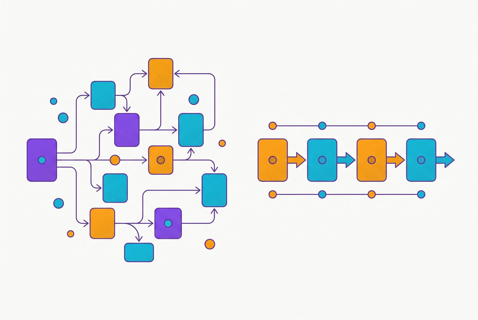
The strongest enterprise onboarding sequences don't pick a side between interactive and linear. They run both formats at different points in the same journey, handing off from one to the other as the cognitive job of the moment changes.
A practical version of that sequence starts before signup, with an ungated short linear video or a light interactive tour on the product page, giving prospects a taste of the product's value before they've committed to creating an account. Once a user starts their first session, a brief linear welcome handles orientation: role selection, expectation setting, routing the user onto the right path, without asking them to act before they understand what they're being asked to do. From there, the activation phase shifts to an interactive walkthrough that requires task completion, because this is the exact moment where learning-by-doing produces retention, and the user should walk away having completed one action that represents the product's real value.
After activation, the reinforce phase, covering roughly the first week, leans on behavioral trigger emails, contextual in-app tooltips, and short linear videos aimed at specific features, deepening the user's understanding of adjacent parts of the product without requiring a whole new interactive sequence every time. Ongoing training follows the same pattern as new features roll out: linear video introduces the concept and the context, interactive walkthroughs handle the hands-on practice once the user is ready to put the new workflow to use.
Role segmentation sharpens both formats rather than replacing either one. A role-specific interactive walkthrough and a role-specific explainer video both beat their generic equivalents, for the simple reason that a user pays more attention to content that matches the job they actually do. The signup signals a company already collects, role, company size, integration intent, use case, can route users into the right sequence of formats, not just the right words within a single format.
Running two formats well does mean maintaining two kinds of content, which is the operational barrier that pushes most teams back toward a single default in the first place. Teams working with AI-assisted platforms that turn raw screen recordings into finished documentation and finished video in parallel are in a better position to justify running both formats, since the same recording can become a step-by-step guide and a polished walkthrough video without doubling the production effort. Clueso is one example of a platform built for that kind of paired output, generating both a written walkthrough and a produced video from a single recording, which lets a team reinforce the same workflow through two different formats instead of choosing one and hoping it covers both jobs.
The teams getting the best activation numbers out of their onboarding are the ones who stopped expecting one format to do every job, and built a process for assigning the right one, stage by stage, moment by moment, to the specific cognitive task the user is facing right then.