Feature Adoption Campaigns Using Short-Form Product Videos
Short videos targeting one use case per user role convert better than generic product tours.

A user can log in every day and still never find the one feature that would make the product indispensable. That's the real shape of the adoption problem: not whether someone opens the app, but whether they ever reach the specific moment where a specific feature clicks for them. Active users don't quit because the product failed them. They quit because a capability sat there unused and unexplained until it stopped mattering. Text tooltips, release notes, and in-app banners all ask something of the user at the worst possible time: read this, picture how it works, figure out whether it applies to you. That's real mental effort, asked for at the exact moment a user's attention is thinnest. And the moment that actually converts someone looks different depending on who they are. A sales rep and a customer success manager can use the same product and need completely different proof before the feature means anything to either of them.
Short-form video as a delivery mechanism for adoption, not just awareness
Short-form video is winning in product education because of how people actually take in new information, not because it's trendy, and that behavior carries straight from marketing into onboarding and feature rollout. A video shows the real click path, inside the real interface, ending in the real result. Nothing is left for the user to picture on their own. That matters most in the first few minutes of trying something new, when guessing wrong is what makes a person give up. Vidico's 2026 State of Creative in Tech found that nearly all consumers have watched an explainer video to learn about a product, a figure no marketer inflated for effect. It says the format is already a habit: a feature adoption video isn't teaching someone a new way to learn, it's using the way they already learn.
The structural rule that makes or breaks a feature adoption video: one use case, one video
The single biggest mistake in feature adoption video is trying to cram too much into one clip. Do that, and the moment of understanding never lands for anyone, because no one in the audience was actually the intended audience. A feature adoption video isn't a product tour. It walks through one workflow for one user role and ends on a result that person can see and recognize as useful. Designforce's 2026 guide points to a short, narrow length range as the sweet spot for engagement, and that limit isn't just a style preference. It forces discipline: there's no room to cover more than one use case once the runtime is that tight. OpusClip's 2026 analysis found something sharper still. Short-form platforms give a video a hook window of about 3 seconds, and algorithmic decisions about whether to keep showing it start almost immediately. A feature's value has to show up in that opening beat. There's no space for a slow setup.
Take a reporting dashboard as an example. A sales rep needs to see how to pull a pipeline forecast in two clicks. A customer success manager needs to see how to flag at-risk accounts from the same dashboard. A finance lead needs to see how to export numbers for a board deck. That's three videos, not one, each short, each built around a single outcome for a single role. One long walkthrough covering all three would ask each viewer to sit through two-thirds of a video that has nothing to do with their job. A modular library, where each clip targets exactly one feature and one role, lets people find and watch the three minutes that actually apply to them. Dropbox proved the value of this kind of narrow focus years ago with a two-minute animated explainer built to solve one problem (people not understanding what Dropbox did), and that single video, aimed at a single confusion point, contributed to a conversion lift and millions of additional sign-ups. Narrow focus on one problem is what produces action that can actually be counted.
Matching adoption videos to the user journey
A well-made video can still fail completely if it shows up at the wrong time. The same clip that converts a user on day three of their trial can land with zero effect if it arrives on day thirty, after that person has already written the feature off or worked around it some other way.
Three moments in the user journey call for different kinds of videos. The behavioral trigger window runs from around day 3 to day 30: analytics flag a user who hasn't touched a key feature inside that window, and the system automatically sends a short, personalized video, framed as a product manager walking that specific user through that specific feature. The third moment calls for a behavior-triggered intervention, not a generic nudge, aimed at the exact gap the data just surfaced. The second moment comes after activation, once a user has already picked up the core features. That's when they're most open to discovering adjacent or more advanced capabilities, because they've already cleared the basic learning curve and have room left to take in more. Slack's approach to onboarding is a useful illustration here: contextual tips fire based on what a user just did, and more advanced features get revealed gradually rather than all at once, which keeps the timing tied to actual behavior instead of a fixed schedule. The third failure to guard against is treating video delivery like a newsletter, sending it out on a calendar instead of in response to what a user is actually doing. A calendar send reaches people before they're ready or after they've stopped caring. A behavior-triggered send reaches them while the gap is still open.
Producing feature adoption videos consistently enough to cover a full feature set
None of this works unless a team can actually produce enough video to cover a real feature set, and that's where most adoption campaigns quietly fall apart before they start. Traditional production can't keep pace with what full coverage demands, and closing that gap requires an AI-assisted production process built for volume rather than one-off polish.
The math makes the problem concrete. A mid-size SaaS product with fifteen significant features, three user roles, and three language markets needs a large library of short videos, and traditional production timelines make that volume commercially out of reach for most teams. The production model that actually closes the gap runs in three layers. A storyboard layer catches structural problems, like the wrong shot order or the wrong use case, while they're still cheap to fix. An AI generation layer handles script cleanup, voiceover, zoom, and captions. An orchestration layer assembles and manages the resulting assets across the whole library. Catching a sequencing mistake at the storyboard stage costs nothing. Catching it after several rounds of AI generation costs credits, time, and another full review pass. Automated post-production cuts the time from concept to finished video dramatically, and that's the shift that makes weekly or even daily output realistic for teams that used to ship once a month. None of this removes human judgment from the process. The product manager or customer success manager who knows which use case matters most for a given role still writes the brief, and still signs off on the final cut. AI handles the repetitive production work in between, which used to make shipping at any real volume impossible.
Building the video library: how to prioritize which features to cover first
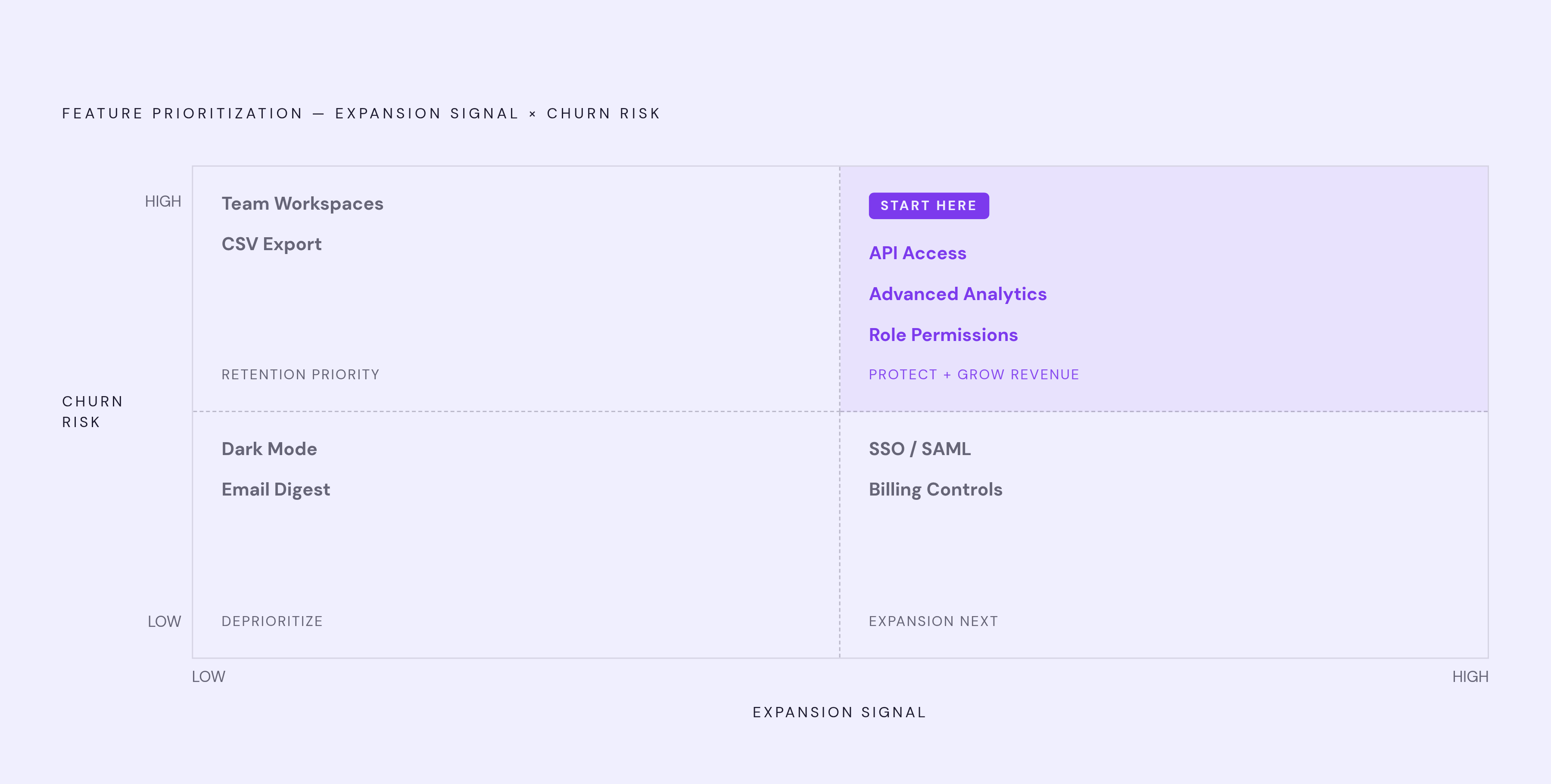
Once a team can actually produce at volume, the next question is which features go first, and the answer shouldn't be whatever shipped most recently or whatever the product team is proudest of. It should come from a simple two-axis view of the feature set. One axis is churn risk, measured by the share of churned users who never activated this feature. The other is expansion signal: how strongly does adoption of this feature line up with upgrades or renewals?
Features that score high on both axes go first. They protect revenue that's already at risk and open the door to new revenue at the same time. Newly released features deserve coverage before launch, not after, so a video is ready the moment the feature ships, right when it's most top-of-mind for both the team promoting it and the users most likely to try it. After the highest-risk features are covered, the next priority is expanding coverage across user roles for those same features, rather than moving straight on to lower-priority features that haven't earned a spot yet. A team can sit down with this matrix today, score its own feature list on these two axes, and walk away with an actual order of operations rather than a guess.
Localization as a coverage multiplier, not a separate project
A feature adoption video that a user can't fully follow in their own language doesn't produce a moment of understanding. It produces confusion, and that failure often hides inside numbers that look fine on the surface. A strong overall completion rate can sit on top of a much weaker rate among non-English speakers, and aggregate reporting won't show the difference unless the data is broken out by language.
Localizing that full library multiplies the volume once language enters the picture. A library that covers a full feature set in English turns into a far larger library once it's localized across markets, and traditional dubbing at professional studio rates makes that scale cost-prohibitive for most teams, with figures sourced from Immersive Fox. AI-based localization changes that math, cutting costs substantially and turning a process that used to take weeks into one measured in hours, which is what makes localizing an entire library a realistic step rather than a someday goal. New Com Academy used AI localization to cut costs by more than 85% compared to a fully manual process, and internationalized its Academy content without reshooting a single video. CEO Michael Kibele confirmed that even complex technical terminology came through the translation with precision. The real question localization answers is whether the campaign actually works for every user who isn't reading it in English.
Measuring whether a feature adoption video campaign is working
View counts and completion rates alone don't say whether a feature adoption campaign is doing its job. Feature activation does. Did users who watched the video activate the feature at a higher rate than users who didn't? That's the campaign's direct output, and it should show up inside the same behavioral trigger window the video was sent in.
A few other metrics round out the picture. Support ticket volume for the covered feature is one: fewer "how do I do this" tickets means the video is doing the explaining that used to fall on a support team. Upgrade and renewal rates among users who activated the featured capability are another, pointing to whether the feature is driving the kind of usage that keeps revenue and grows it. At the video level, completion rate by feature video shows exactly where viewers drop off before reaching the payoff. A video with weak completion is either running too long, failing to hook fast enough, or aimed at the wrong use case for the role watching it. The trap to avoid is measuring performance in aggregate, averaged across every feature clip in the library. That average hides which specific features are failing to convert, so the data needs to be segmented by feature, by user role, and by language before anyone can act on it. For ROI, two tracks run in parallel: an efficiency track, measuring support tickets reduced times the cost of resolving each one, and a pipeline track, measuring incremental retention and expansion revenue tied to adoption. The efficiency track is the one to lean on early, since it's easier to attribute cleanly to the video itself.